What is our favourite website design of 2016, and why do we think it’s awesome?
Well, recently Patrick Faller from Adobe asked us what our, current, favourite website is. We had a long and hard think about it, and came to a conclusion. Have a look at what our answer was!
Ask a UXpert: Designs We Love, October Edition
As fall gets into full swing, our UXperts are hard at work scouring the internet for the best examples of great design. We’ve asked them to share their favorite websites, right now. So while you’re googling how to make the perfect pumpkin spice latte, check out these designs they love:
George Gomez, Creative Director at SOAP Goods Creative
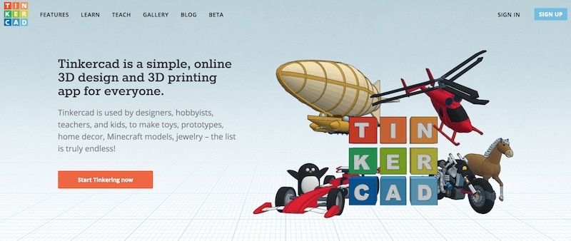
Pick: tinkercad.com
 I’m a self-employed designer and my wife is in the creative agency world, so it is no surprise that our seven-year-old son has taken to creating things himself. Over the summer, he became curious about creating toys and at the suggestion of a camp counselor we checked out Tinkercad. While it doesn’t have the reach of more sophisticated 3D modeling software, it’s a great place for him (and myself) to explore the practice and process of 3D rendering. To date, we’ve created several designs and are awaiting the arrival of his first 2 toy prototypes!

Why I love it: Tinkercad is a part of a growing movement to teach design (and in turn, problem solving skills) at an early age. By creating free, browser-based applications, sites like Tinkercad are providing tools for a generation of designers, making them more technically prepared at an earlier age than previous generations. To top it off, it’s just pretty damn cool to watch a seven-year-old let his imagination run wild in a space that simply didn’t exist for his parents.
Lindsay Campbell, Developer & Designer at Oonie
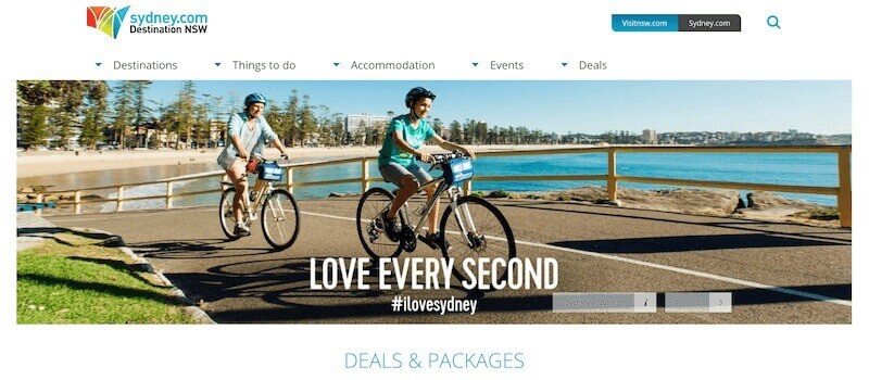
Pick: sydney.com
 Within 3 seconds I could see immediately that I wanted to stay on New South Wales’ user-friendly tourism site. The Functionality is awesome: straight away I can see the buttons at the top covering the main interests any tourist would have. The rollover has further navigation options and, in one click, I can search for accommodation via the dropdown menu. I then get taken to a ‘search accommodation’ page where I can refine my search easily. It is the same for the events, destinations, and deals. Only one annoying pop-up and no flashing calls to action.

Even the footer works well – if you chose an area from the footer you will get a dedicated page with links to attractions, accommodation, events. This makes life so easy for the user. The look and feel is minimalistic and clear and the layout is appealing to the eye. The text communicates information clearly and adds to the atmosphere of the home page, and the images are fun and lively.
Jonathan Pimento, Product Manager at Adobe XD
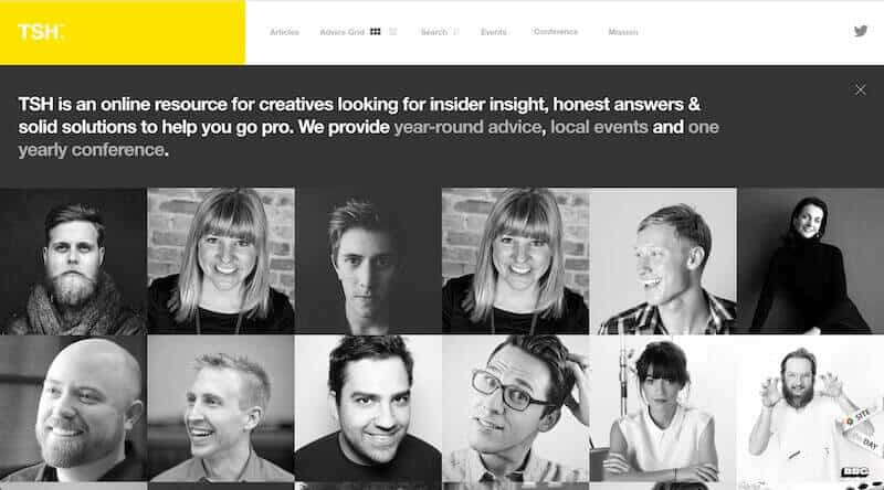
Pick: learntsh.com
 The Secret Handshake by the team at BBG is a great example of minimalism in web design. What’s really interesting about TSH is it’s not just their design that’s minimal but even the content they deliver. It’s a great place for designers, students, and creatives to find inspiration, insights, and answers in the form of snippets from creative pros. The website makes use of three simple elements:
- Bold typography coupled with a minimal palette which sits on top of a clean and simple grid. The simplicity and design of the grid makes this a very adaptive experience for any screen size, device, or breakpoint. Grids are a great way to organize content and TSH takes it one step further by allowing you to interact with the content on the same page (5 points for not making us hit that back button!)
- The reading experience is a real delight. It’s another great example of how paying attention to the little details like the font-size and line-height uplift the reading experience for the browser.
- The sparing use of color coupled with the B&W photography really works well, especially when a major part of your design is influenced by user-submitted imagery or content. They even switch out the right images based on a whether you are accessing this on a retina screen.

Emma Paul, Web Designer & Front End Developer at Emma Paul
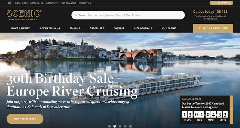
Pick: scenic.com.au
 As a Designer, I’m always on the lookout for websites that are beautiful on the outside, but have the brains and brawn to back it up. Recently, while researching my next luxury holiday (read: design project), I discovered the Scenic website which I found to be captivating and beautiful, but more importantly, intuitive, inspiring and easy to digest. Here’s why:
- It’s Captivating: A picture is worth 1000 words. From my first encounter with the site, I am both captured and inspired by the strong image choices used to represent the various tours and itineraries. The website color scheme is strong, but takes a back seat to the images, allowing them to shine.
- It’s Pretty: We’re all a little superficial and it’s no secret that first impressions count (and convert) online. Their branding is both modern and on-trend, and lends itself well to the clean, minimal page design/layout.
- It’s Intuitive: As soon as I land on the website, I know how to get started. It’s easy to find what I’m looking for (even if I’m not 100% sure what that is) and if I need help, it’s readily available.
- It’s Inspiring: There are no dead ends. As I browse the site, I’m prompted to view another related trip or experience.
- It’s Digestible: With so many tours, and so much information to showcase, a ‘simple’ balance would have been hard to strike. Browsing the site, I feel there is plenty of breathing room. I don’t feel rushed off to the next CTA or bombarded with information. I’m the one driving.

